Master FillThatPDF!
Comprehensive guides for all features. Standard and PRO editions.
🚀 Getting Started
FillThatPDF! offers three distinct ways to process your documents.
Make Fillable + Test Fill
The Default Magic. Creates BOTH a blank fillable PDF and a test-filled version instantly. Use this for 90% of your work.
Make Fillable ONLY
For Customization. Creates only the blank fillable PDF. Use this if you plan to edit fields in the Visual Editor before testing.
Test Fill ONLY
For Verification. Takes an existing fillable PDF (that you just edited) and fills it with test data.
🎨 Formatting Presets
Configure all field formatting before creating your PDF. Save presets per client so every form is perfectly formatted from the start.
Why Presets Matter
Without presets, you'd need to manually adjust font, size, color, alignment, and borders for every single field after creating a fillable PDF. With presets, you configure everything once upfront and every field is created with those settings automatically. This can save hours of tedious per-field formatting.
Open Settings
Click the ⚙️ Settings button to open the Settings panel. At the top you'll see the Preset controls: a dropdown to select or create presets, a 💾 save button, and a 🗑️ delete button.
Configure Your Formatting
Set up all the formatting options you need under the 📝 Fillable PDF tab:
- Font Family: Helvetica, Times New Roman, Courier, and more
- Font Size: Set the exact point size for all fields
- Text Color: Choose the font color for field text
- Alignment: Left, center, or right alignment
- Border Style: Solid, dashed, beveled, inset, underline, or none
- Border Color & Width: Full control over field borders
- Background Color: Set fill colors for fields
- Checkbox Style: Check ✓, circle ●, cross ✗, square ■, diamond ◆, or star ★
- Date Format: Auto-format date fields (MM/DD/YYYY, DD/MM/YYYY, etc.)
- Phone Format: Auto-format phone number fields
- Currency Format: Auto-format currency fields with symbols and decimals
- Single Line Field Height: Standardize field heights across the form
Save as a Preset
Select ➕ Create New Preset from the dropdown and give it a name (e.g., "ClientA - Standard Forms" or "Government Blue Theme"). All your current settings are saved instantly. You can create as many presets as you need.
Use a Preset
Next time you process a PDF for that client, simply select their preset from the dropdown before clicking "Make Fillable". Every field will be created with the correct formatting automatically.
Pro tip: Create presets for each of your regular clients. When a new batch of forms comes in, just pick the right preset and click go — consistent, professional results every time without touching a single field property.
Update or Delete Presets
To update an existing preset, select it, make your changes, then click the 💾 save button. To remove a preset, select it and click the 🗑️ delete button.
🔧 Auto-Calibration
Let the app analyze your PDF and automatically optimize detection settings for the best possible results.
What It Does
Auto-Calibration scans the structure of your PDF — page layout, line spacing, text density, and element sizes — then automatically adjusts detection settings to produce the most accurate field placement. It replaces the need to manually tweak dozens of individual settings.
How to Enable It
Open ⚙️ Settings and look under Detection Controls. The Auto-Calibration toggle is on by default (recommended). When enabled, it greys out the individual detection settings it manages — you don't need to worry about them.
When to Turn It Off
For most PDFs, leave Auto-Calibration on. You might turn it off only if you need very specific manual control over detection thresholds for unusual or non-standard PDF layouts.
Recommended: Keep Auto-Calibration enabled for the best results. It analyzes each PDF individually, so it adapts to every document you process.
📏 Single Line Field Height
Standardize the height of all single-line text fields across your entire form for a clean, uniform look.
What It Does
Many PDFs have inconsistent field sizes — some lines are tall, some are short, and it looks messy when filled. The Single Line Field Height setting forces all single-line text fields to a consistent height (in inches) that you specify. Multiline fields, grid cells, and checkboxes are not affected.
How to Use It
Open ⚙️ Settings and scroll to the Advanced Layout section. You'll see the highlighted ⭐ Single Line Field Height control:
- Toggle: Turn the feature on or off
- Height value: Enter the desired height in inches (default: 0.25"). Range: 0.05" to 1.0"
Smart Behavior
The setting is intelligent — if an existing field space on the PDF is smaller than your specified height, the smaller space is preserved. This prevents fields from overlapping neighboring content. Only fields that have room to expand will be standardized to your chosen height.
Common values: Use 0.25" for standard forms, 0.20" for dense government forms, or 0.30" for forms that need larger text entry areas. This setting can be saved as part of a preset for each client.
✨ Using Instant Test Fill
The exclusive feature that no other tool has. Verify field placement in seconds without manual typing.
Generate Your PDF
Click "Make Fillable + Test Fill" to get both PDFs at once. Or use "Make Fillable Only" first if you want to edit fields before testing.
Configure Keywords (Optional)
Go to Settings > Test Fill. Map field names to specific values. Example: Set "City" fields to always show "New York".
Pro Tip: Use realistic data to spot formatting issues (e.g. check if a long address fits in the box).
Review Results
You'll get two files: _Fillable.pdf (blank form) and _TestFilled.pdf (with data). Open the Test Filled version to instantly spot misalignments.
⭐ PRO Edition Features
The following tutorials cover features available in FillThatPDF! PRO
✏️ Visual Field Editor PRO
Drag, drop, and resize fields with pixel-perfect precision. Full control over every aspect of your fillable PDF.
Open the Editor
After processing with "Make Fillable Only", the "Edit Fields" button will pulse. Click it to open the Visual Editor.
Select & Move Fields
Click any field to select it. Drag to move. Drag corners to resize. Hold Shift and click to multi-select.
Use the Properties Modal
Double-click a field (or click the ⚙️ icon) to open the Properties Modal. Here you can configure:
- General Tab: Name, tooltip, font, size, alignment, colors
- Appearance Tab: Border style, fill color, line width
- Flags Tab: Required, read-only, multiline, comb
- Format Tab: Date, currency, phone, number formatting
- Calculate Tab: Auto-calculating fields with formulas
- Actions Tab: JavaScript triggers
Save Your Changes
Click Save to apply your changes to the PDF. Then use "Test Fill Only" to verify your customizations.
✨ AI Auto-Name PRO
Automatically name fields based on column headers. Includes automatic tooltip generation.
Single Field Auto-Name
In the Properties Modal, click the ✨ Auto-Name button. The AI will analyze the PDF text around the field and suggest a name based on nearby labels or column headers.
Batch Auto-Name
Select multiple fields (Shift+click), then use the batch panel's ✨ Auto-Name All Selected button. All selected fields will be named at once!
Smart Numbering: When multiple fields get the same name (like a column of "Date" fields), they're automatically numbered: Date_1, Date_2, Date_3...
Automatic Tooltips
When fields are auto-named, the tooltip is automatically set to match the field name. This improves accessibility and helps users understand each field's purpose.
🧮 Smart Calculations PRO
Build auto-calculating fields that update in real time. Supports SUM, MULTIPLY, AVERAGE, constants, custom formulas, and more — all compatible with Adobe Reader.
Step 1: Open the Calculate Tab
Double-click any field on the canvas (or select it and click the ⚙ icon) to open the Properties Modal. Then click the 🧮 Calculate tab.
Step 2: Choose a Calculation Type
Select your operation from the dropdown. Each type automatically generates industry-standard PDF JavaScript that works in Adobe Reader, Acrobat, and all major PDF viewers.
- SUM: Adds all source field values together (e.g., Line1 + Line2 + Line3 = Total)
- SUBTRACT: Subtracts each subsequent source field from the first (e.g., Gross - Deductions = Net)
- MULTIPLY: Multiplies all source field values together (e.g., Quantity x Price = Amount)
- DIVIDE: Divides the first source field by the second (e.g., Total / Count = Average)
- AVERAGE: Calculates the mean of all source fields
- MIN: Returns the smallest value among the source fields
- MAX: Returns the largest value among the source fields
- PRODUCT: Same as MULTIPLY — multiplies all values together
- CONSTANT MULTIPLY: Multiplies a single field by a fixed number (e.g., Subtotal x 0.08 = Tax)
- CUSTOM: Write your own JavaScript formula for complete control
Step 3: Select Source Fields
Tell the calculation which fields to use as inputs. There are three ways to add source fields:
- Canvas Pick (recommended): Click the 🎯 Pick from Canvas button, then click directly on fields in the PDF canvas to add them. See below for full details.
- Search: Type a field name in the search box — matching fields appear instantly. Click to add.
- Manual Entry: Type the exact field name if you already know it.
Source fields appear as a list below the search box. Click the × next to any field to remove it from the calculation.
Constant Multiply tip: When you choose "Constant Multiply", a number input appears where you enter the constant (e.g., 0.08 for 8% tax or 1.15 for a 15% markup). You only need one source field for this type.
Step 3b: Interactive Canvas Field Picker
The 🎯 Pick from Canvas button activates an interactive mode that lets you build formulas visually by clicking fields directly on the PDF:
- Activate: Click the 🎯 Pick from Canvas button in the Calculate tab. The cursor changes to a crosshair and the canvas enters pick mode.
- Click to add: Click any field on the PDF canvas — it's instantly added as a source field. The field flashes to confirm it was picked.
- Pick multiple: Keep clicking more fields to add them all. Each click adds another source field to your formula.
- Finish picking: Click the 🎯 Pick button again (or press Escape) to exit pick mode and return to normal editing.
Why use the canvas picker? It's the fastest way to set up calculations on complex forms. Instead of remembering or searching for field names, just point and click on the fields you want. This is especially useful for large tables where you need to sum an entire column — just click each cell from top to bottom.
Step 4: Configure Rounding & Decimals
Fine-tune how results display:
- Decimal Places: Set the number of decimal places (0–10). Use 2 for currency, 0 for whole numbers.
- Rounding: Choose from Round (standard), Floor (always round down), or Ceiling (always round up).
Step 5: Live Test Your Calculation
No need to save and reopen! The Live Test panel appears at the bottom of the Calculate tab. Enter test values for each source field and see the result update instantly. This lets you verify your formula works correctly before saving.
Verify complex setups: For multi-step calculations (like Subtotal → Tax → Grand Total), test each field individually to confirm the chain works end to end.
Step 6: Use the Calculations Manager
Click the 🧮 Calculations button in the toolbar to open the Calculations Manager panel. This gives you a bird's-eye view of every calculation in your document:
- See every calculated field, its type, source fields, and constant (if applicable)
- Click the 🔧 wrench icon to jump straight to that field and open its Calculate tab
- Click the 🗑 trash icon to remove a calculation
- The currently selected field is highlighted in the list automatically
Custom Formulas
Choose CUSTOM from the type dropdown to write your own JavaScript. The code editor appears with syntax highlighting. Your script must set event.value to the result. Example:
// Calculate total with 8% tax

var subtotal = AFMakeNumber(getField("Subtotal").value);

var tax = subtotal * 0.08;

event.value = subtotal + tax;
Power tip: Custom formulas can reference any field, use conditional logic (if/else), and call built-in PDF JavaScript functions like AFMakeNumber(). This gives you unlimited flexibility.
Import Existing Calculations
Already have a PDF with calculations built in Adobe Acrobat or another tool? FillThatPDF! reads them automatically. When you open a PDF in the Visual Editor, all existing calculation scripts are detected, parsed, and displayed in the Calculate tab — ready to view, edit, or extend. Supports all standard patterns including AFSimple_Calculate, constant multipliers, and custom scripts.
🕐 Version History PRO
Never lose work. Create snapshots, compare versions, and rollback to any previous state.
Open History
Click the 🕐 History button in the toolbar.
Create a Snapshot
Click 📸 Create Snapshot and give it a name (e.g., "Before major changes"). Your current field state is saved.
Best Practice: Create a snapshot before making significant changes. It's your undo safety net!
Compare Versions
Click 🔍 Compare on any snapshot to see what's changed:
- Fields added since the snapshot
- Fields removed since the snapshot
- Fields modified (position, properties)
Rollback
Click ⏪ Restore on any snapshot to instantly revert to that state. All fields and settings are restored.
📦 Batch Processing PRO
Process hundreds of PDFs at once. Perfect for standardizing agency forms.
Select Batch Mode
On the home screen, click the "Batch (Folder)" tab at the top.
Choose Folders
Select your Input Folder (containing your PDFs) and an Output Folder for the results.
Run
Click Process All. The app processes every PDF using your detection settings and saves fillable versions to the output folder.
Performance: Batch processing is optimized for speed. You can process 100+ PDFs while you take a coffee break!
🤖 AI Assistant PRO
Your personal PDF expert powered by Google's Gemini AI.

Open the AI Chat
In the Visual Editor, click the 🤖 AI Chat button in the toolbar.
Ask Contextual Questions
The AI "sees" your current PDF structure and selected fields. Ask things like:
- "Why wasn't the signature field detected?"
- "Suggest better names for these fields."
- "How do I align the Total column?"
- "What regex would validate a phone number?"
- "Help me set up calculations for this form."
Configure Your API Key
You'll need to provide your own Gemini API key. Go to Settings > AI and paste your key. Get one free at Google AI Studio.
⚙️ Complete Settings Reference
Every option explained. Master FillThatPDF! with complete control over detection, styling, formatting, and output.
🔍 Detection Controls
Control how FillThatPDF! finds and identifies form fields in your PDF.
| Setting | Options | Description |
|---|---|---|
| Auto-Calibration | On (default) / Off | Automatically analyzes your PDF structure and optimizes detection settings for the best results. When enabled, individual detection settings below are managed automatically. Recommended for most users. See tutorial ↑ |
| Detection Sensitivity | Conservative, Standard, Aggressive | Conservative: Only detects obvious fields, fewer false positives. Standard: Balanced detection for most forms. Aggressive: Finds more fields including smaller ones, may have some false positives. |
| Detect Image Placeholder Boxes | On / Off | When enabled, finds empty rectangular areas (signature boxes, photo placeholders, etc.) and creates fields for them. Useful for forms with designated signature or image areas. |
| Detect Signature/Text Lines | On / Off | Detects underscore patterns (____) as text entry fields. Essential for forms that use lines instead of boxes for data entry. |
| Auto-group Radio Buttons | On / Off | Automatically groups nearby "Yes/No/NA" checkboxes into radio button sets, ensuring only one can be selected at a time. |
| Detect Table Cells | On / Off | Identifies table structures and creates fields within table cells. Essential for data collection forms with tabular layouts. |
| Skip Fields Near Page Edges | On / Off | Ignores potential fields detected near page margins. Reduces false positives from page borders, headers, and footers. |
☑️ Checkbox Settings
Fine-tune checkbox detection and appearance.
| Setting | Default | Description |
|---|---|---|
| Minimum Checkbox Size | 8 pt | Smallest square shape that will be detected as a checkbox. Increase to ignore tiny decorative elements. |
| Maximum Checkbox Size | 18 pt | Largest square shape that will be detected as a checkbox. Larger boxes become image placeholders instead. |
| Checkbox Widget Size | 10 pt | Size of the interactive checkbox widget that gets created. Adjust to match your form's visual style. |
| Checkbox Mark Style | Check (✓) | The symbol shown when checkbox is checked. Options: check ✓, circle ●, cross ✗, square ■, diamond ◆, star ★ |
🎨 Visual & Styling
Customize the appearance of form fields.
| Setting | Default | Description |
|---|---|---|
| App Theme | Dark | Switch between Dark and Light modes for the application interface. Does not affect the PDF output. |
| Field Background Color | #EDF4FF (light blue) | The fill color for text fields. Choose a subtle highlight color to help users identify fillable areas. |
| Show Field Borders | Off | When enabled, adds visible borders around each form field. Useful for forms where original field boundaries are unclear. |
| Default Font Size | 9 pt | The font size used for text entry. Choose 0 for "auto" which dynamically sizes text to fit the field. |
| Font Family | Helvetica | The font used for field text. Options: Helvetica, Courier, Times-Roman, Arial. Choose fonts that match your form's design. |
| Font Color | #000000 (black) | The color of the text users type into fields. |
| Small Field Threshold | 100 pt | Fields narrower than this width are center-aligned; wider fields are left-aligned. Helps with short fields like state codes. |
📋 Auto-Formatting (JavaScript)
Smart formatting that automatically formats user input as they type.
| Setting | Default | Description |
|---|---|---|
| Enable Currency Formatting | On | Fields with names containing "cost", "price", "amount", "total", etc. will automatically format input as currency (e.g., $1,234.56). |
| Enable Date Picker | On | Fields with "date" in their name get a date picker dropdown. Users can type or select from calendar. |
| Enable Phone Formatting | On | Fields with "phone" or "tel" in their name automatically format as phone numbers as user types. |
| Enable Number Formatting | On | Numeric fields automatically add thousand separators and limit decimal places based on your settings. |
Currency Options
| Currency Symbol | $ | The currency symbol to display. Change to €, £, ¥, etc. for international forms. |
| Symbol Position | Before | Show symbol before ($100) or after (100€) the amount. |
| Decimal Places | 2 | Number of decimal places for currency values. |
| Thousands Separator | , (comma) | Character between thousands groups. Use "." for European format. |
Date Options
| Date Format | MM/DD/YYYY | Format pattern for date display. Common formats: MM/DD/YYYY (US), DD/MM/YYYY (European), YYYY-MM-DD (ISO). |
| Date Separator | / (slash) | Character between date parts. Use "-" for ISO style dates. |
Phone Options
| Phone Format | (XXX) XXX-XXXX | Pattern for phone number formatting. X represents a digit. Common formats: (XXX) XXX-XXXX (US), XXX-XXX-XXXX, +1 XXX-XXX-XXXX. |
Number Options
| Decimal Places | 2 | Default decimal places for numeric fields (non-currency). |
| Thousands Separator | , (comma) | Character between thousands groups in numbers. |
| Negative Style | Minus | How to display negative numbers: minus (-100), parens ((100)), or red (red text). |
📐 Advanced Layout
Fine-tune field dimensions and positioning.
| Setting | Default | Description |
|---|---|---|
| ⭐ Single Line Field Height | Off / 0.25" | Force all single-line text fields to a consistent height (in inches). If the existing space is smaller, the smaller size is kept. Does not affect multiline or grid fields. Great for standardizing forms. See tutorial ↑ |
| Field Gap | 0.5 pt | Minimum gap between adjacent fields. Increase to prevent fields from touching. |
| Minimum Field Width | 20 pt | Fields narrower than this are skipped. Lower to detect small fields; raise to ignore decorative elements. |
| Minimum Field Height | 10 pt | Fields shorter than this are skipped. Prevents detection of thin lines as fields. |
| Cell Coverage Threshold | 70% | When a field covers this percentage of a table cell, auto-expand to fill the entire cell. Keeps fields aligned with table structure. |
| Auto-expand Small Fields | On | When enabled, narrow fields are automatically expanded to fill their containing table cell. |
🎚️ Detection Thresholds (Advanced)
Expert-level controls for detection behavior. These override sensitivity presets.
| Setting | Default | Description |
|---|---|---|
| Min Underscore Length | 3 characters | Minimum number of underscores (___) to detect as a text field. Increase to avoid detecting abbreviations like "___" as fields. |
| Min Empty Box Width | 100 pt | Minimum width for empty rectangular boxes to be detected as fields. Lower detects smaller boxes. |
| Min Empty Box Height | 30 pt | Minimum height for empty boxes. Helps distinguish fields from thin decorative rectangles. |
| Page Edge Margin | 30 pt | Fields within this distance from page edges are skipped when "Skip Page Edges" is enabled. |
🛠️ Debug / Developer
Tools for troubleshooting and development.
| Setting | Default | Description |
|---|---|---|
| Check for Software Updates | On | Automatically checks for new versions when the app starts. Disable if you prefer to update manually. |
| Verbose Logging | Off | Shows detailed detection information in the log panel. Useful for debugging why certain fields weren't detected. |
| Preserve Existing Widgets | Off | When enabled, keeps any existing form fields in the source PDF instead of replacing them. Useful for updating partially fillable forms. |
| Generate QA Overlays | On | Creates visual overlay images showing detected fields. Helpful for verifying field placement during development. |
📁 Output Settings
Control output file naming.
| Setting | Default | Description |
|---|---|---|
| Fillable PDF Suffix | _fillable | Text appended to the filename for the fillable PDF output. Example: document.pdf → document_fillable.pdf |
✨ Test Fill Configuration
Configure how the exclusive Test Fill feature populates your forms.
| Setting | Default | Description |
|---|---|---|
| Fill Engine | Smart | Smart: Python-powered, format-aware filling that respects validation and formatting. Quick: JavaScript-based, faster but simpler filling. |
Keyword Categories
Test Fill matches field names against these keywords and uses appropriate sample data:
| Category | Keywords | Sample Data |
|---|---|---|
| Names | name | John Smith, Sarah Johnson, Michael Brown... |
| Companies | company, business | ABC Corp, XYZ Industries, Global Solutions... |
| Phones | phone, tel | (734) 555-0123, (248) 555-0456... |
| Dates | date, signed, completed | 01/15/2026, 02/20/2026, 06/15/2025... |
| Addresses | address, street | 123 Main St, 456 Oak Ave, 789 Pine Rd... |
| Cities | city | Detroit, Ann Arbor, Grand Rapids... |
| States | state | MI, OH, IL, CA, NY, TX, FL... |
| ZIP Codes | zip | 48201, 48202, 48226, 48235... |
| john@email.com, sarah@company.com... | ||
| Currency | cost, price, total, amount, fee | $1,250.00, $3,500.00, $750.00... |
| Percentages | efficiency, afue, seer, hspf | 95%, 98%, 85%, 92%... |
Customization: You can edit these keyword categories and sample data in Settings → Test Fill to match your specific industry or form types!
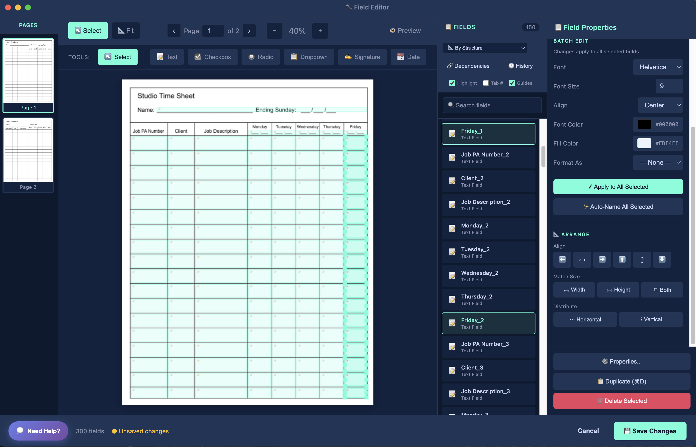
🎨 Field Editor
Powerful visual tools to fine-tune your fillable PDFs after initial creation. Access via "Edit Fields" button after processing.
Selection & Navigation
| Feature | Description |
|---|---|
| Page Thumbnails | Navigate between PDF pages using thumbnail sidebar. Click any thumbnail to jump to that page. |
| Marquee Selection | Drag to select multiple fields at once. Hold Shift to add to selection, Ctrl/Cmd to toggle. |
| Field List Panel | View all fields on current page with names, types, and coordinates. Click to select, double-click to edit properties. |
| Zoom Controls | Zoom in/out with mouse wheel or zoom buttons. Fit to page, fit to width, or custom zoom levels. |
Field Manipulation
| Tool | Shortcut | Description |
|---|---|---|
| Move Fields | Drag | Click and drag any field to reposition it. Alignment guides appear automatically when fields align with others. |
| Resize Fields | Drag corners | Drag corner handles to resize fields. Maintains aspect ratio with Shift key. Minimum sizes enforced automatically. |
| Duplicate Fields | Ctrl+D / Cmd+D | Create copies of selected fields with automatic offset positioning. Perfect for repetitive form elements. |
| Delete Fields | Delete / Backspace | Remove selected fields from the form. Changes are tracked for undo/redo. |
Alignment & Distribution
| Tool | Description |
|---|---|
| Align Left/Right | Align selected fields to the leftmost or rightmost field in the selection. |
| Align Top/Bottom | Align selected fields to the top or bottom edge of the selection. |
| Align Centers | Align fields horizontally (center X) or vertically (center Y) to the selection center. |
| Distribute Horizontally | Evenly space selected fields between the leftmost and rightmost fields. |
| Distribute Vertically | Evenly space selected fields between the top and bottom fields. |
Radio Button Groups
| Feature | Description |
|---|---|
| Group Checkboxes | Select multiple checkboxes and group them into a radio button set. Only one can be selected at a time. |
| Ungroup Radios | Break apart radio button groups back into individual checkboxes. |
| Auto Radio Detection | Settings option automatically groups nearby checkboxes with similar labels (Yes/No/NA patterns). |
Field Creation Tools
| Tool | Description |
|---|---|
| Text Field | Add new text input fields. Drag to create rectangle, then customize properties. |
| Checkbox | Add individual checkboxes. Can be grouped into radio buttons later. |
| Radio Button | Add radio buttons that belong to a group. Specify group name in properties. |
| Dropdown List | Create dropdown menus with custom options. Perfect for state/country selections. |
| Signature Field | Add signature capture areas for digital signatures. |
| Date Picker | Add date fields with built-in calendar picker. |
Advanced Features
| Feature | Description |
|---|---|
| Snapshots | Save and restore editor states. Perfect for trying different layouts or creating backup points. |
| Tab Order Editor | Customize the order users navigate through fields when pressing Tab. Essential for logical form flow. |
| Preview Mode | Test your form in fillable mode without leaving the editor. See how it looks and behaves for users. |
| Undo/Redo | Full edit history with 50-level undo/redo. Never lose your work accidentally. |
| Field Properties | Comprehensive properties panel for each field: name, tooltip, validation, formatting, appearance, and behavior. |
Pro Tip: Use the Field Editor after initial PDF processing to perfect your forms. It's especially powerful for complex forms with many fields or custom layouts that need precise positioning.